Halved menu support calls by turning a white-glove service into a self-serve product
-48% less menu-related support calls
+63% faster menu creation (from 2hrs to under 45mins)
+184 hours saved by removing double handling
MY ROLE
End-to-end Product Design Lead, co-owned product strategy with Product Manager
SCOPE
Web, tablet and mobile. ~10 ordering app partners, 13+ point of sale (POS) systems, venues with up to 10,000 items
TIMELINE
2022 - 2023 (discovery to launching to 4,000 venues)
TEAM
Product Manager, Engineering lead, FE & BE Engineers and a second designer working 1 day a week
Context:
The service model was capping growth
Doshii sits between a venue's point of sale system and the ordering apps it sells through, like Uber Eats, DoorDash and Deliveroo. It had about 60 people and is owned by Commonwealth Bank, Australia's largest bank.
The founders built Doshii in a garage, literally, and ran it as a white glove service. Customer Success did nearly everything for venues, menus most of all. Setting up a menu meant a 1-2 hour call with a support officer. Running out of beef patties on a Friday night meant phoning support to pause the item.
Venues liked it, but it capped growth. Every new venue added a permanent human cost, and roughly half of support's time went on menus.

The project had to balance three forces:
Venues: less admin and a thirty-second fix mid-service, for owners and floor staff who aren't technical.
Doshii: lower cost to serve. Fewer menu calls was the whole business case.
The platform: 13+ point of sale systems of wildly varying data quality, publishing to ~20 apps with their own menu rules.
I ran 40+ interviews with venue owners, managers and staff. Two findings reset the plan: menus were far more complex than we'd modelled (a coffee comes in several types, sizes and milks, priced differently on each app), and mobile-first was the wrong bet (Decision 4).
Decision 1:
Stop doing the work for venues
The brief was to build a menu builder. Delivering it meant changing how the company worked.
Rejected: keep white glove and build internal tooling. Lowest risk, lowest ceiling. Growth stays tied to support headcount.
Rejected: full self-serve for every venue. It was the design ideal, but not every venue fits it.
Chosen: self-serve by default, white glove where it counts. Research showed smaller venues usually had simpler menus, while larger venues and groups had more complexity and were worth more to Doshii. Most venues build their own menus, and high-value venues kept a mostly white glove service.

One of the founders pushed back hard, and he was protecting something real. White glove set Doshii apart, and his fear was specific: hand a busy publican a tool, the menu goes stale, and Doshii owns the blame.
I led with the arithmetic: half of support's time went on menus, mostly on the simplest calls. I ran alignment workshops with leadership before any design existed, and proposed a pilot so the objection got tested rather than argued. With senior leadership behind it, the decision carried, and the personas from this research became the shared language for Marketing, Sales and Product.
The bigger lesson: self-serve doesn't have to be all or nothing. Keeping the human service where it earns its cost is what made the change safe to make.
Decision 2:
Where the source of truth lives
When the point of sale and Doshii disagree about an item, something has to win. This was the most consequential structural decision in the product.
Rejected: the point of sale is always the source of truth. Clean and easy to reason about, and it fails in reality. Most point of sale menu data was a mess: uncategorised, inconsistently named, no descriptions or images, often structured for a kitchen printer rather than a customer. Mirroring a mess publishes a mess to Uber Eats.
Rejected: Doshii is always the source of truth. Good for quality control, but it overrides venues who already keep tidy point of sale data, and fights a system they trust.
Chosen: the venue chooses. Doshii always reads from any supported point of sale and can update live. Venues with well-organised point of sale data keep editing there. Venues with messy data, the far more common case, make Doshii the source of truth, which pushes back to the point of sale and out to every app.

This let one product serve both ends of a 13+ vendor landscape, including older systems that couldn't hold the detail Doshii could. A menu could be richer than the venue's point of sale allowed, instead of capped at the weakest system it connected to.
The bigger lesson: on a platform, "who owns the truth?" usually has a different honest answer per customer. Make ownership explicit and switchable, then default to what is right for most.
Decision 3:
Build once, publish everywhere, and let price differ
Venues thought in one menu per app: rebuild it in Uber Eats, again in Deliveroo, again in Mr Yum. That mental model was the double handling we were trying to remove, so I couldn't honour it, and I couldn't ignore it either.
Rejected: one menu per app. It matched how venues already thought, and it would have rebuilt the exact double handling we were trying to remove.
Rejected: one menu for all apps. Simple, but venues run different menus for delivery and in-store, and head office operators run several venues at once.
Chosen: one item library, many menus, many apps. An item library is the single store of items, menus are assembled from that library, and each menu publishes to many apps at once.
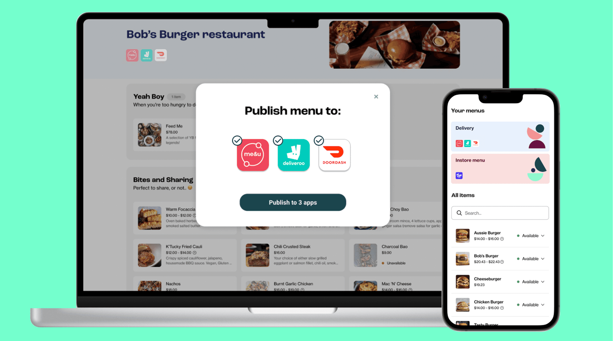
Then research changed the model. Venues told us apps charge very different commissions, Uber Eats charges around 30% commission, so one price everywhere means eating the difference. Price had to belong to the item on a specific app, not to the item.
In the interface that became a single toggle: same price on all apps by default, and when a venue switches it off, per-app prices appear inline beside the app logos.
The bigger lesson: the obvious data model is the one the domain suggests: a menu has items, items have prices. The right one came from asking what the venue was optimising, which was margin per app.

Decision 4:
Fork by moment, not by feature parity
We planned to build mobile first. It is the standard play for a new product, and the hypothesis was reasonable: these users are on their feet in a venue, so they'll reach for their phone.
Research killed it. Interviews surfaced two separate jobs that wanted opposite things:
Build and maintain the menu. Seated, high-concentration work: thousands of items, images, option groups, per-app prices. Venues preferred desktop and wanted more room, not less.
"I've just run out of beef patties." Mid-service, one hand free, thirty seconds. Get the item off every app before the orders and refunds start. Nobody at Doshii had this on the roadmap.
"When you're busy, the last thing you want to do is go through 8 machines to update an item you ran out of." - Tim, venue owner

Rejected: mobile-first with full feature parity. A responsive version of everything would have served neither job well.
Chosen: fork by moment. Desktop got the full depth: item detail, option groups, surcharges and discounts, drag-and-drop ordering, publish. Mobile and tablet got one job done extremely well: find an item, flip its availability, get back to service. Same visual language, so it never felt like a different product.
This cut mobile scope dramatically. The engineering effort went into the desktop data-complexity problem instead, which is where the difficulty actually was.
The bigger lesson: mobile-first is a heuristic, and I nearly shipped a strategy off the back of it. When two user jobs pull in opposite directions, parity is the expensive way to satisfy neither.
Craft:
making 10,000 items feel calm
The decisions set the structure. The craft problem was that a venue with 10,000 items opens the product after being on its feet since 6am.
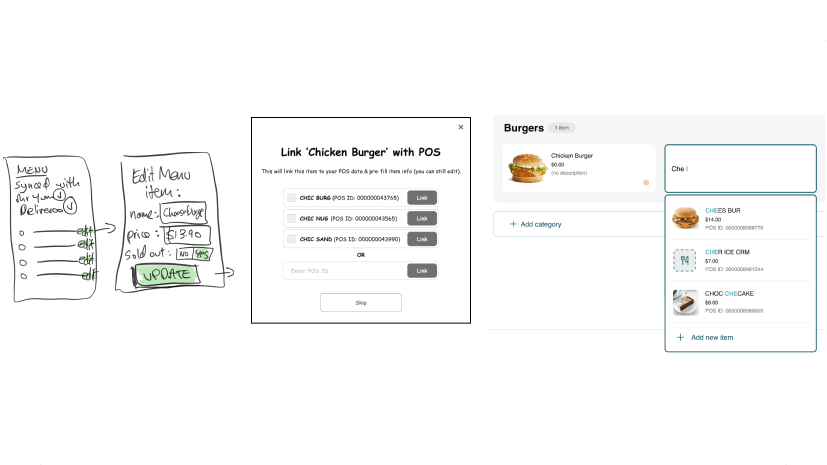
State readable at the row. Price, availability and the apps an item publishes to are all visible without opening anything. A price range signals per-app pricing. Venues scan for problems instead of auditing.
Availability one tap deep, everywhere. It is the highest-frequency action, so it is a dropdown on the row, never a settings page.
Layers, not walls. Menus collapse to category headers with item counts, so a huge catalogue opens as a dozen readable rows. Item detail opens as a panel over context, so nobody loses their place.
Two ways in. An All Items view with search, sort and filter for people who know what they want, and menu cards for people who don't.
I worked with the UI Style Guide team to reuse existing components and contributed new ones back, each with an annotated state matrix so Engineering built from a specification, not a screenshot.
What outlived me
I left Doshii in April 2023. Menu Manager still ships with the same structure: build once and publish to Uber Eats, DoorDash and the rest, per-app pricing, availability toggling, and any point of sale connected to Doshii.
The clearest proof came from something I never designed. Because venues now built their menus inside Doshii, the company had structured menu data it never had before. Doshii turned that into Menu Temp Check, a free tool that scores a venue's delivery menu across six categories and recommends changes to drive more sales. It exists because of the self-serve decision.

My key learnings
Test the platform assumption on day one. Mobile-first survived all the way to a plan before research killed it. The assumption most worth testing is usually the one nobody in the room is arguing about.
Answer objections in the product, not only in the organisation. The founder's fear was a stale menu. I answered it with escalation, a pilot and the source-of-truth choice, all organisational moves. Prompts for menus that haven't changed, and a first-run flow that gets a venue to a published menu, would have answered him inside the product too.
On a platform, the structure is the product. Two of my four decisions had almost no visible interface, and they're why Menu Manager absorbed new apps, new point of sale systems and a whole new product without a redesign.
That's the work I want more of: platform products where the design decisions are structural, the users are under real pressure, and good design shows up in the operating cost as well as the interface.
Latest Projects