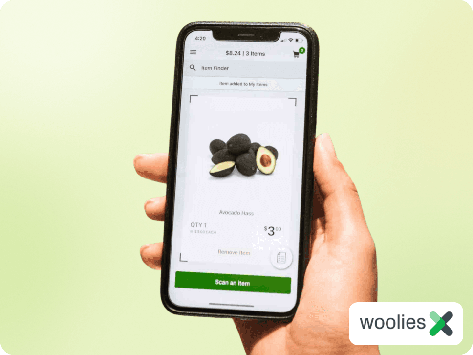
Designed Australia's first checkout-free supermarket shop and scaled to 60+ stores
First of its kind ‘just walk out’ shopping experience
4M shops a year at peak, 5-10% of store sales
High retention - 64% of first-time users came back for a 2nd shop
Scaled across Australia from a one-store pilot

MY ROLE
Senior Experience Designer (Product & Service Design)
SCOPE
iOS & Android apps, digital scale UI, checkout tablet UI
TIMELINE
2019 - 2021
TEAM
Head of Product, Frontend & Backend Engineers and a second designer supporting delivery
Context
The brief was open-ended: find the future of shopping, then work out whether it was worth building.
I planned and ran the discovery, with lab interviews and contextual inquiry in stores. It pointed somewhere narrower than the brief. People liked the shop itself, choosing produce, walking the aisles, seeing what was on special. What they wanted to skip was the last five minutes: the queue, unpacking onto the belt, repacking into bags.
So we stopped trying to reinvent shopping and focused on removing the checkout. That gave the project a scope we could ship.
I led design end-to-end for two years with one other designer supporting. Most of the work sat outside the app: produce scales, exit points, gates, signage, and what a team member says when a customer asks how this works.
Three constraints shaped every decision:

Customers wanted to skip the queue without feeling like a shoplifter on the way out.
The business needed shrinkage at or below self-checkout. Loss Prevention had a veto. If theft went up, the project was dead regardless of how customers felt.
Stores varied. 60+ formats, floor plans, staffing levels and baseline theft rates, each needing installation and staff training.
Most of this case study is about the trade-off between the first two: how much trust to extend, and what it costs in shrinkage.
Decision 1:
Whether to keep an exit step
Scan&Go’s value proposition was ‘skip the queue’ which meant a change to how customers exited the store.
The normal way of grocery shopping:
Shop → queue → scan → pack → pay → exit
The Scan&Go experience:
Shop → scan → pack → pay → exit
Three exit options emerged:
Pure walk-out - nothing between paying and the door.
Tap-off tablet - a small tablet near the exit, scanned on the way out. This shipped first.
Tap-off plus a gate that opens on a successful tap. Shipped as we scaled.
I ran contextual research in-store to test early exit and tap-off concepts:

We built the tablet because the pilot had to be lean, but I'd have kept an exit step regardless. In testing, customers didn't want to walk straight out. They wanted a visible moment that showed they'd paid, in front of other shoppers and staff.
One participant said:
“I don’t want people to think I’m stealing a trolley full of groceries.”
The gate came later, for a different reason. Opening it only on a successful tap-off gave senior leadership enough confidence to launch into stores with much higher baseline theft rates than the pilot store.
The bigger lesson: the friction customers ask you to remove isn't always the friction that makes them comfortable. Our product was named for having no checkout and still needed a checkout-shaped moment, first for customers and then for the business.

Decision 2:
How much checking to build in
Loss Prevention's constraint was simple. Shrinkage had to match or beat self-checkout.
Rescan everything at the exit - defensible to the business, but it rebuilds the queue and removes the point of the product.
No checks at all - the best experience, and Loss Prevention would never have approved it.
Random partial audits - most shops end with no intervention; occasionally a team member checks a few items. Shipped.
I expected option 3 to be the weak point. I thought having your bag checked would feel accusatory, that it would land badly on customers we'd just promised a trusted experience, and that team members would dislike doing it.
I led customer research that uncovered a key insight: occasional bag checks were expected.
One participant mentioned:
“I don’t mind about bag checks as long as it’s not too often... If it happens too much it would get annoying and defeat the purpose of the app”
Complaints were minimal from both customers and staff. Customers understood the trade better than I did: you skip the queue, we check sometimes.
The bigger lesson: test the assumption you're most confident about first. Being wrong about the audit model in one store cost a few weeks. At 60 stores it would have cost us either the shrinkage numbers or the control that made Loss Prevention comfortable.

Decision 3:
Whether to fork by store format
Scan&Go ran in two very different stores. A Metro in the city is a small basket and a quick trip. A full-line supermarket is a weekly shop with a full trolley.
One universal exit would have been simpler to build, train and maintain across 60+ sites. I forked it, but only in one place:
Full-line stores got a dedicated lane with its own tap-off point, bypassing the checkout queues.
Metro stores got small tap-off points beside the existing self-checkout machines.
The exit does a different job in each. In a full-line store the queue is the pain, so the bypass has to be visible, and customers need to see themselves walking past the line. In a Metro there's barely a queue. The win is speed, and floor space is expensive, so the exit sits where people already walk.
The app didn't fork. Scanning, running total, produce, payment: identical in both.
The bigger lesson: fork where the need is different, not where the surface is. Two store formats looked like an obvious reason to build two products. The narrower question is what each part is actually for. For twelve square metres of floor near the door the answer differed. For everything else it didn't.

Decision 4:
Solving the two-hands problem
In-store research kept surfacing the same thing. People wanted a free hand, whether they were picking up something bulky, carrying a bag or holding a baby. Phone-first put a device permanently in one hand, in an environment where both hands are in use. We could reduce how often people needed to look at the phone, but not free the hand.
I led workshops that uncovered two promising ideas:
A: Phone lanyards: easily let your phone hang from the lanyard while grabbing items.
B: Trolley phone holder: attach the phone to the trolley to free up both hands.
Winner? B: Trolley phone holder
The problem with the phone lanyard was that the phone would swing around a lot and the risk of hitting something and damaging the phone was high. Trolley phone holders were a real unlock for the Scan&Go experience - but also for other non-Scan&Go users too.
I tested different paper prototypes and how the experience worked with the Scan&Go app. I passed the requirements to suppliers who built the prototypes. That work led to 100,000+ trolley phone holders rolling out across Australian stores.

What outlived me
I left Woolies in 2021 but Scan&Go is still going strong in 2026. The app was expanded into a tablet attached to a trolley - based off the groundwork that myself and the team did. It uses the same service with the device moved out of the customer's hand. The running total, produce flow, exit verification and random partial audits are the model we originally designed.
The item finder shipped into the main Woolworths app. I designed it for Scan&Go so customers could ask where a product was and get the aisle. It performed well enough that it launched into the main Woolworths app, reaching millions of customers who had never used Scan&Go. A feature built for a 60-store pilot now lives in the flagship shopping app used across the country.
What I'd take into the next project
Design around the constraint that can hurt the project. Loss Prevention had a veto from day one. Treating theft as a later-phase problem would have been easy, but putting the audit model in the pilot meant every store after that was argued from evidence.
Test your most confident assumption early. I was sure bag checks would feel like accusations. Finding out in one store was cheap. At sixty it wouldn't have been.
Lean choices buy speed now and cost you later. Phone-first is why it scaled to 60 stores. We named the problem in research, and the current product is what fixing it looks like
Latest Projects